Layer Settings
- The user can set the Panel Background Color, Maximize widget by color, widget icon color, box-shadow color, blur, spread, and other similar properties related to the widget
Layer Settings: This video contains how to use Layer Settings in OPNBI.
- To change the settings of a Layers Widget, follow the steps below:
Click on the top right corner of your layer widget to enter the edit mode.
In the edit mode, click on the Settings icon from the top right corner of your table widget to change the settings.
This will open the following configuration menu:-

The user can change the widget properties as follows:-
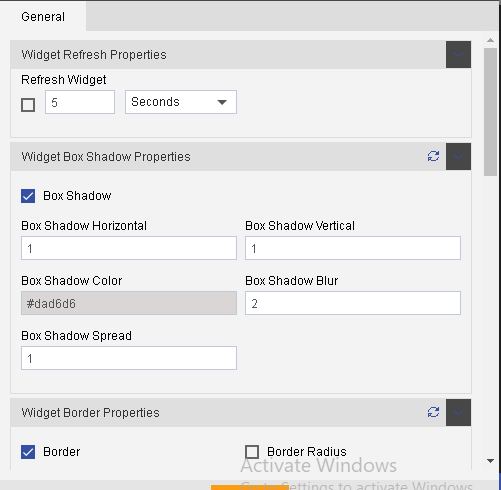
Here in the above figure, widget properties have been set.
The widget will be refreshed after every single minute.
The user can set the Panel Background Color, Maximize widget by color, widget icon color, box-shadow color, blur, spread, and other similar properties related to the widget as shown above.
The user can also provide a border to your widget and change its properties such as border type, width, color as shown in the figure above.
The user can show or hide the border by clicking on the Border checkbox.
If you want the layer widget to have a rounded corner you can specify the radius property for the top and bottom as shown in the figure above.
The user can also change the background image as shown below:-
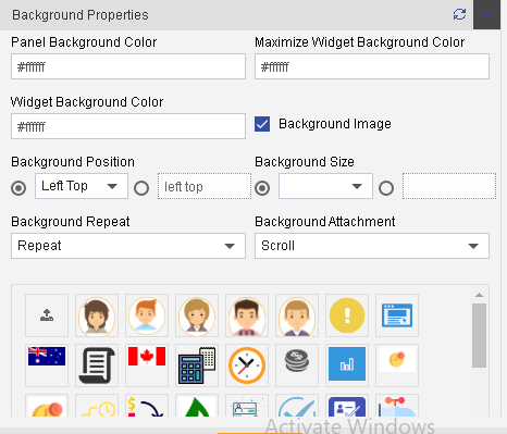
To provide background properties as depicted above, you need to click the Background Image checkbox.
After that user can provide background color, change background-position and size.
Additionally, the user can also set an image as a background and mention how the image should be attached to the background or repeat based on the size of the image.
The users can also upload their images if desired by clicking on the image icon.
The user can set the Title properties by checking the Title Properties checkbox as shown below:
Here you can set the position of the title, title color, font size, font style, font family, and font weight.

In the similar manner you can set Sub Title properties by checking the Sub Title Properties checkbox as shown below:-

You can also provide a border to the sub-title by checking the Sub Title Border as shown in the figure below:-

You can also hide the data from certain devices, hide icons, show filter value, or wait for a filter by checking the checkboxes shown above (Filter will be discussed in detail in later sections).
Now Click on the button to save the layer widget.
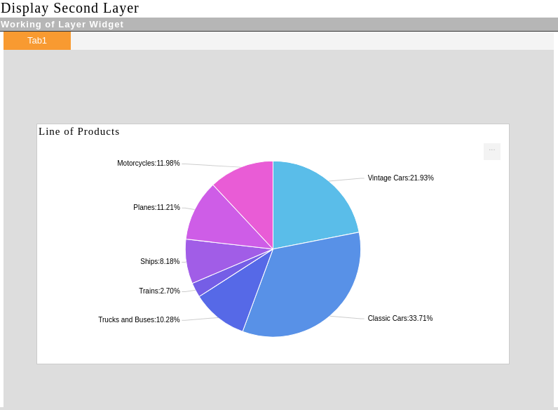
Finally, your image will be displayed as follows:-
In this manner, users can change the settings of their layer widget to provide formatting of their choice.